
We engaged with heyZensei to reinvigorate and add to the Pazanga Health website years after an initial rebrand. They really understood our brand and were able to capture it authentically and beautifully, not only through the narrative but also the color choices, the dynamic programming and the ability to understand how visitors would want to best experience our site. They were also an absolute pleasure to work with.
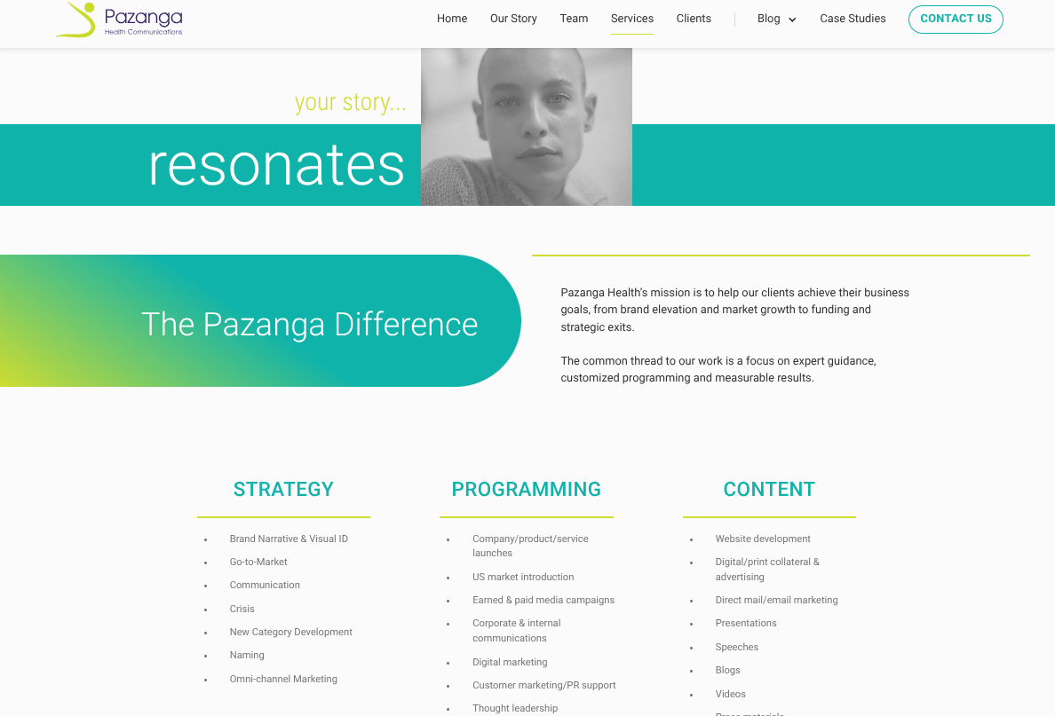
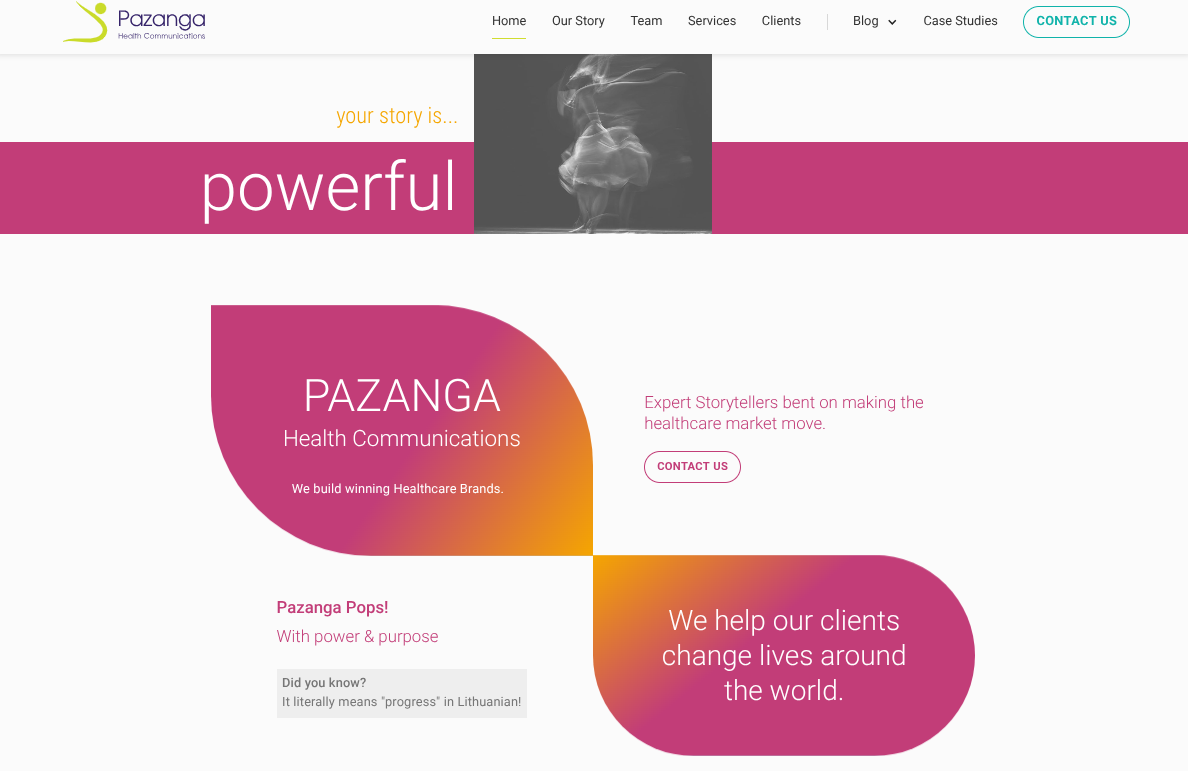
Pazanga was already doing top-quality work in healthcare marketing and PR. The website was still telling a smaller, older version of the story.
It looked dated, felt harder to manage, and was not doing nearly enough to help the business build trust or win new opportunities. heyZensei stepped in to give the site a clearer story, a more modern experience, and a better platform underneath it — all without blowing up the content and starting from scratch. Because sometimes the smartest move is not “redo everything.” It is “make what’s already here finally earn its keep.”
The old site was doing the bare minimum: existing.
It felt dated, harder to manage, and too weak as a business-development tool for a firm doing serious work. On top of that, the client did not want a full content overhaul. The ask was more specific — keep the core content, modernize the experience, and create stronger proof paths through an Our Story page and a better Case Studies collection.
That made this more interesting than a standard refresh. The site needed to feel more polished, more strategic, and more persuasive while still working with what was already there. It also needed to become easier for the Pazanga team to manage without turning every update into a small production.


The biggest shift was not just visual. Pazanga’s website went from feeling like a business accessory to acting like a business asset.
The story got clearer. The site got easier to manage. The proof got easier to find. And the overall experience finally started matching the quality of the work behind the business. For a firm selling expertise and trust, that is not a cosmetic improvement. That is a business one.
Even at a directional level, the trend is encouraging. Over the post-launch period, web traffic roughly doubled from the initial tracked window into the stronger stretch that followed. Average time on site also increased by about 100% across Q1, which is a strong sign that visitors were not just showing up — they were sticking around long enough to actually engage with what they found.
The audience also began reaching the site through a broader mix of incoming channels, which points to a healthier digital presence overall. In plain English: the site was not just prettier. It was becoming easier to find, easier to trust, and more worth spending time with.
If your website is still telling an older, smaller version of the story, let’s fix that.
.avif)

.jpeg)