Cole and AJ from HeyZensei are creative geniuses. Their ability to truly see you and your business and help you show that through your website is amazing. Their “workshop” is so thorough and they helped me think of things that I’ve never thought of. They know how to ask the right questions, and then make your website beautiful and truly representative of you and what important to you. My website is 20 times better than it was before. I thought I had done a decent job making my own website, but there were so many things I didn’t know how to do, and I thought “good enough “, but my website is so much more professional and eye-catching than it was before. It was so nice to be able to hand this project over to them and have full confidence that they would do a good job.
Path to Health had been helping people feel better for nearly 15 years. But the website was not doing a great job proving it.
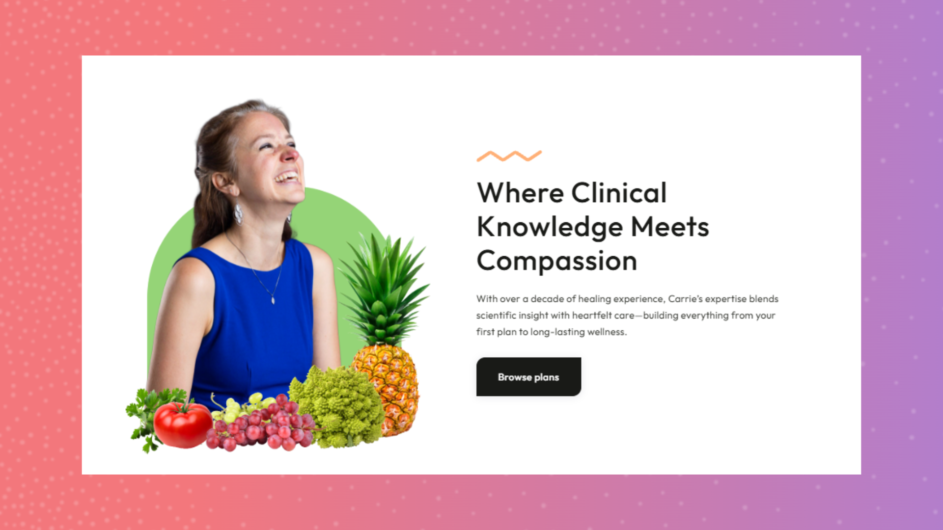
The business was well established, but the site felt self-built, low-energy, and harder to engage with than it needed to be. It also did not do much to reflect the warmth, encouragement, and personalized care behind the actual service. heyZensei stepped in to turn that disconnect into a clearer, brighter, more useful digital presence — one that felt more like the business itself and did a better job inviting the right people in.
Before this work, the site was doing the business very few favors.
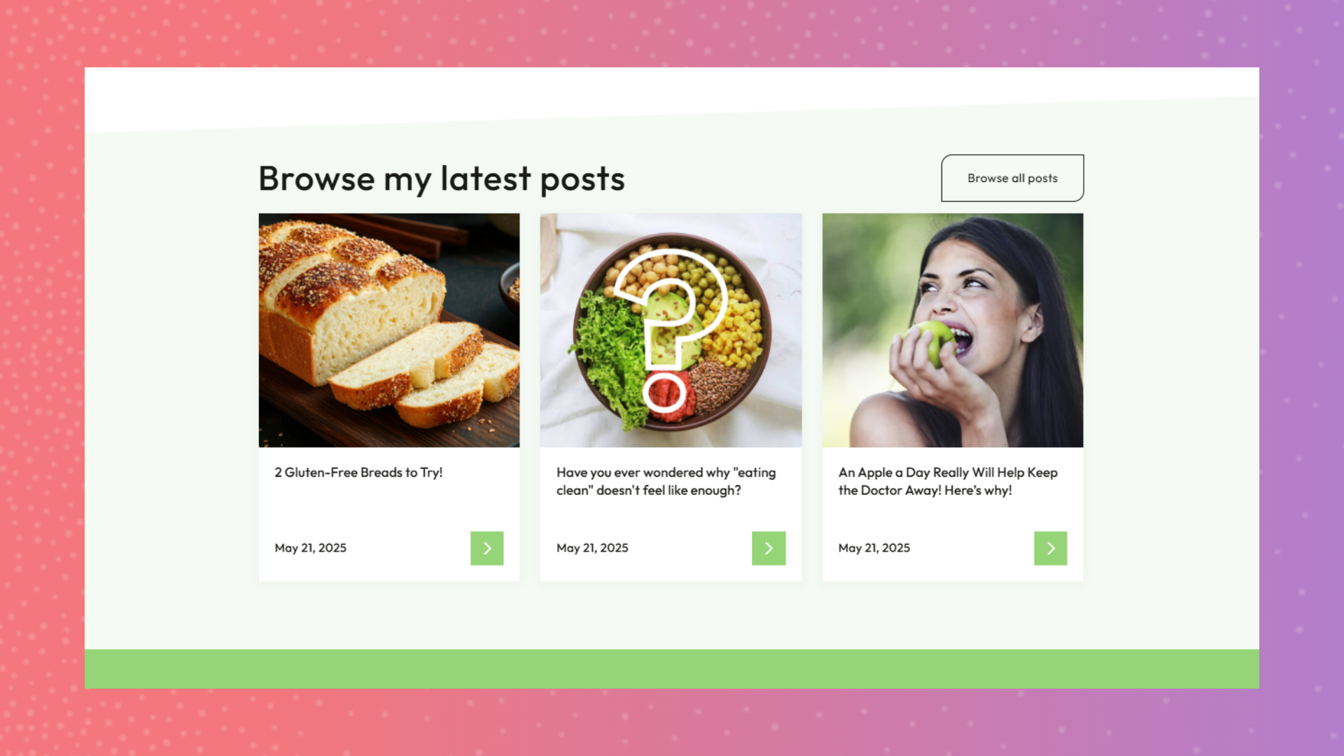
It had functional issues, a weak engagement path, and a DIY feel that made the business look less established than it really was. The experience also leaned on the usual wellness clichés — lots of green smoothies, hyper-clean “health” visuals, and not much sense of the real people or real outcomes behind the work. That left the site feeling less motivating, less human, and less aligned with the supportive, personalized nature of the business.
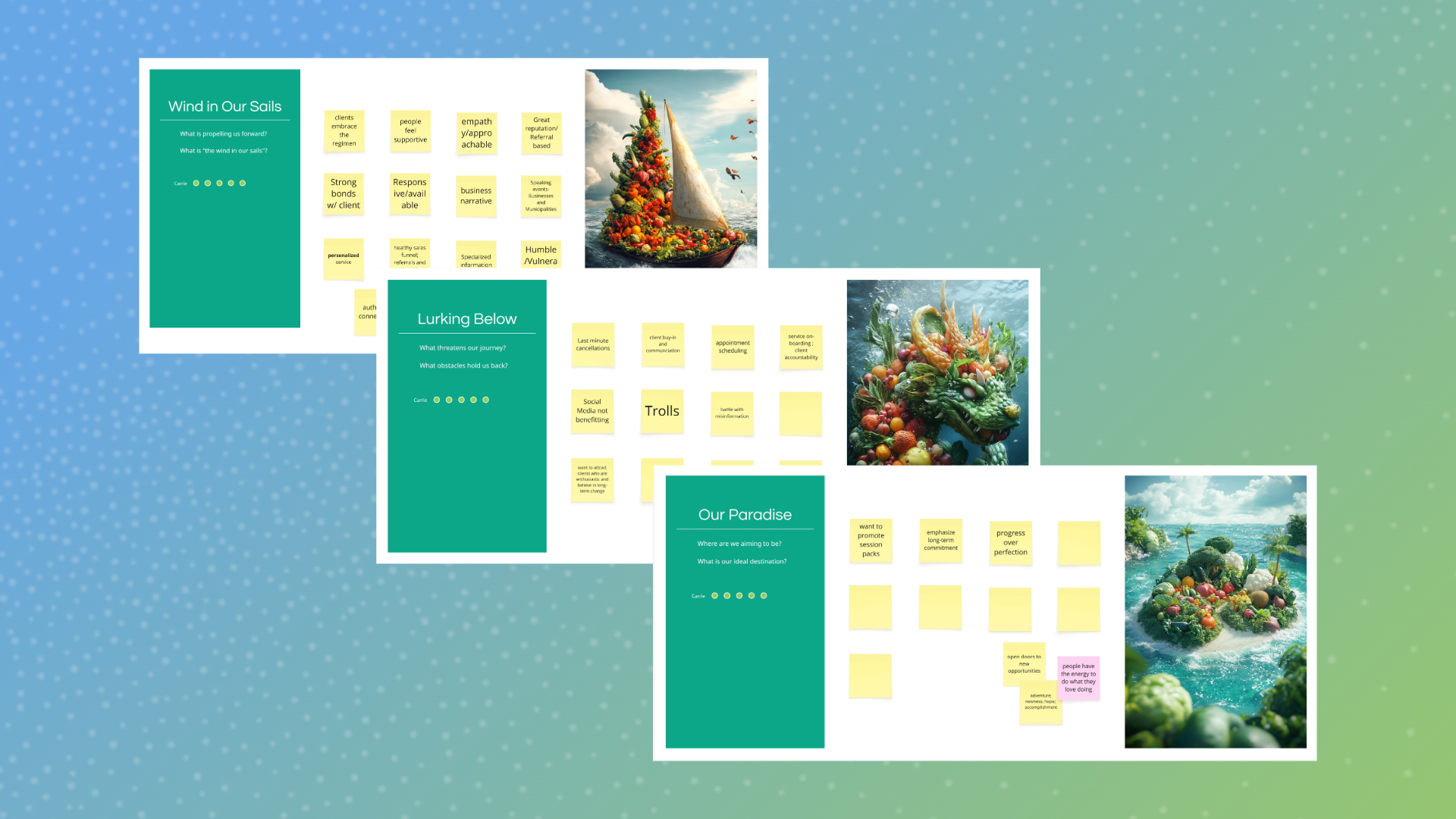
The budget was tight too, which made prioritization especially important. This could not be a “redo everything” situation. It had to be a smarter move: fix what mattered most, strengthen the story, and make the site work harder without turning it into a giant production.


The biggest shift was not just visual. Path to Health’s website started feeling a lot more like the business behind it.
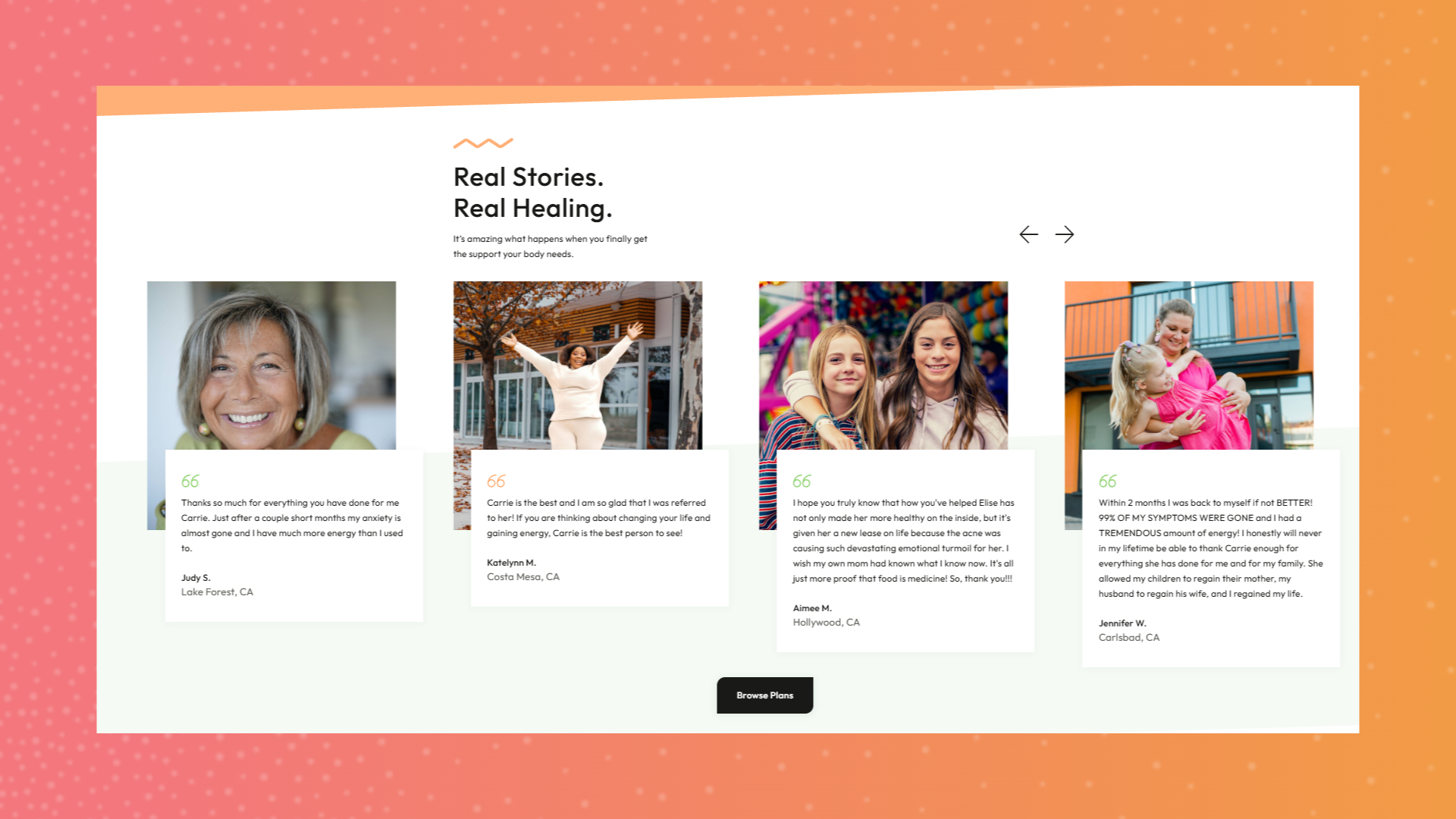
The new site brought in more warmth, more clarity, and a much stronger sense of the actual client experience. It did a better job showing the human side of the work, spotlighting personalized services, and making the business feel more approachable and more credible to people considering reaching out.
It also created a stronger path to action. The updated experience introduced clearer service organization, repeated calls to action, and a more engaging structure overall. That matters because for the old site, simply existing online was doing most of the heavy lifting. The new one gave the business a much better chance to connect, guide, and convert.
Just as important, the final result felt more aligned with the client’s actual in-person presence. That was one of the smartest shifts in the project: making the digital side of the business feel as encouraging, energizing, and approachable as the real one.
If your website looks the part but is not doing much to help, we should fix that.
.avif)
.jpeg)